 ell for starters, typography is not easy. Simply put, these days, It can make or break a design. With so much of an emphasis placed on minimal web-design and usability, you better have a very strong understanding of typography in order to achieve what you are trying to do.
"Typography needs to be experienced."
Ok, So How Do I Get It Together Typographically?
For me, as someone who in the past has relied heavily on graphics for my designs, typography was not always something I excelled at. I've decided to share with you my general rules for typography as far as it relates to the web, and also show some examples, inspirations, and resources for you to look at.
Most of the time I only use 2 different fonts, but at the most 3 should be used for any given project. As you can see this is shown in the article YOU ARE READING!
Let's Start With Some Basics:
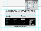
1. Hierarchy - If you look to the right you will see in the first image in the photo-gallery I use font-size and margins to achieve a readable and intuitive breakdown of information for the back of the Burton History Trees business card.
2. Contrast - One of the most important and over-looked ideas about typography is contrast. A good way to achieve contrast is by using two fonts. In particular if you are using a larger heading, try using a different font for the text, in the [example 2] to the right I have used a serif font (Georgia) for a header and a sans-serif font (Arial) as body text.
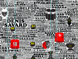
3. Use Only 3 - Most of the time I only use 2 different fonts, but at the most 3 should be used for any given project. As you can see this is shown in the article YOU ARE READING! I used a large Helvetica font for the header, and then a serif font for the intro, and all Arial after that. What you really want to stay away from is something like picture [example 3]! (courtesy of Burton History Trees).
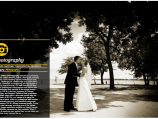
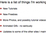
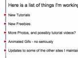
4. Bullets - Bullet points are somewhat a matter of personal preference. I have heard it said that bullet points should align with text, but I feel on the web they are better indented for use of chunking information [example 4]. In both cases as long as a decent margin is used it could be fine both ways. As you can see my bullet points on the site are not indented. I've heard it said for print the bullets and quotations should be in the margin, but sometimes the layout will not allow for it as you can see [example 5].
Well that is a very brief introduction into some of the principals that will pay huge dividends. Next time I will get into more specific font based typographic principals in the follow up to this post!
