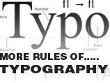
 his is the second part of my typography series. I have decided to address many of the more detailed rules of digital typography in this section. These rules are more guidelines then anything else but if used properly, and in conjunction with the initial rules from the previous section You will see an improvement in your overall designs.
“...Type is a beautiful group of letters, not a group of beautiful letters.”
What Else Do I Need To Worry About Typographically?
The following guidelines pertain more to specifics of sentence and paragraph structure more then anything else. These rules are designed to focus in on your content display and help you make slight subtle adjustments that will make your projects typography more elegant.
Please keep your body text to a maximum of 11px. Anything smaller then 8px is too small to be legible, but once you get above 11px you run the risk of using bulging over-sized text. I'm using 12px - do as I say, not as I do!
Here are some keys:
1. Winning 11 - Please keep your body text to a maximum of 11px. Anything smaller then 8px is too small to be legible, but once you get above 11px you run the risk of using bulging over-sized text. I'm using 12px - do as I say, not as I do!
2. Leftist - Centering text is something I almost never do. There are of course exceptions for this, but for me the majority of the time If I choose to center something it's a title, and if I align text to the right - It's almost always in a header or footer, and a very small piece of text to begin with. The basic rule is just always align left
3. Size It Up - Ok this one is a little tricky, supposedly you are only to use 4 different sizes for fonts. This is something that I obviously do not adhere to, specifically in these articles, but It's a very good idea for minimal web-design. My main take on this is that If you are going to use more then 4 different font-sizes, at least keep to 4 sizes max in any given area - for example If your footer is a site-map, with a contact form, and featured links, you may have crossed the 4 sizes of fonts mark, especially if you want to throw some contact information in. Just be careful not to over do it.
4. A Bold Idea - As far as emphasis - The general thought that I subscribe to is this: Use Bold! I don't like italic or underlining, I simply feel that these two forms of mark-up tend to blend in much more then using a simple BOLD would. It's also good to use a slightly different color for emphasis also, for example, if using a darker text color, I tint the bolded text slightly lighter, or vice-versa.
5. Let's Tighten Up - This is an idea that leading should be tight, most web-designers forget to adjust the line-height in their paragraph styles, what happens is your left with a more generic looking paragraph structure, taking the time to set a line-height will make your typography more visually appealing.
5. A Kernel of Truth - Similarly to adjusting line-height vertically, you want to pay attention to horizontal spacing of letters. It seems obvious, but many fonts are misused digitally simply because a designer was to lazy to define a "letter-spacing" attribute, or even know about it. Look it's as simple as this, a lot of your more fancy font-faces, like Helvetica, or Futura, need a little treatment in order for them to look their best.
Well this concludes my very general rules for typography, It looks like I came up with 9 basics. The most important thing to take away from this are the principals. It's ok to break these rules, like anything else, but you need to know why these rules exist first, then make your own decisions.


